Youth Ministry Website
UX/UI Design | Brand Design
The Youth Ministry is an initiative of the Diocese of Brooklyn that empowers young people — middle school through high school — and Youth Ministers to put their faith in action in our world today, serving their formation and spiritual needs.
Scope
Create a digital hub in which the youth, the formation ministers, and parents were able to interact, share resources, news, publish events, and facilitate communication among everyone.
Constrains
A tight deadline was the main risk for delivering this product on time, a limited budget, the need for this product to be in constant evolution, and the content had to be easily updated.
Problem
Each Youth Ministry had its own communication channels making it difficult to share information with other ministries.
A need for a product/platform easy to access, attractive, and relevant (“cool”) enough that the youth were happy to use and share.
Parents need to be involved and part of the faith formation of their children, or get help on some specific topics.
Users and Audience
We needed to serve the needs of these groups:
Youth Minister: Upload events, download/share resources.
Parents: Find a ministry for their child, sign up for Youth Ministry, and find Youth Ministry events.
Youth: Find helpful resources, get informed of the latest events, and stay connected with youth ministries in different areas.
Roles and responsibilities
In three months of completion, seventy-five percent of the time was for research, design, test, and iterations, the rest was used on the development and QAs. We had a small team formed by:
Marketing Director – Supervising overarching aspects, goals, and success metrics of the project, and providing input on roadblocks in the process.
Project Manager – Conducting the discovery meeting and usability tests, creating the roadmap plan, the site content plan, and coordinating the ins and outs with the client.
Development Team – Providing Functionality Documents, developing the site, QAs.
My role
UX/UI Design:
- Beginning with distilling all the results of the Discovery Meeting.
- Creating site maps, and identifying possible roadblocks.
- User reaching and personas.
- Creation of style concepts and functionality moodboard.
- Wireframing, designing low fidelity and high fidelity prototypes.
- Preparing prototypes for usability testing.
- Creation of design system, setting up final prototypes for mobile and desktop, and overall identity system.
- Coordinating assets development with the developing team.
- Creation of branded placeholders and various pre-made content.
Scope
Create a digital hub in which the youth, the formation ministers, and parents were able to interact, share resources, news, publish events, and facilitate communication among everyone.
Constrains
A tight deadline was the main risk for delivering this product on time, a limited budget, the need for this product to be in constant evolution, and the content had to be easily updated.
Problem
Each Youth Ministry had its own communication channels making it difficult to share information with other ministries.
A need for a product/platform easy to access, attractive, and relevant (“cool”) enough that the youth were happy to use and share.
Parents need to be involved and part of the faith formation of their children, or get help on some specific topics.
Users and Audience
We needed to serve the needs of these groups:
Youth Minister: Upload events, download/share resources.
Parents: Find a ministry for their child, sign up for Youth Ministry, and find Youth Ministry events.
Youth: Find helpful resources, get informed of the latest events, and stay connected with youth ministries in different areas.
Roles and responsibilities
In three months of completion, seventy-five percent of the time was for to research, design, test, and iterations, the rest was used on the development and QAs. We had a small team formed by:
Marketing Director – Supervising overarching aspects, goals, and success metrics of the project, and providing input on roadblocks in the process.
Project Manager – Conducting the discovery meeting and usability tests, creating the roadmap plan, the site content plan, and coordinating the ins and outs with the client.
Development Team – Providing Functionality Documents, developing the site, QAs.
My Role
UX/UI Design:
- Beginning with distilling all the results of the Discovery Meeting.
- Creating site maps, and identifying possible roadblocks.
- User reaching and personas.
- Creation of style concepts and functionality moodboard.
- Wireframing, designing low fidelity and high fidelity prototypes.
- Preparing prototypes for usability testing.
- Creation of design system, setting up final prototypes for mobile and desktop, and overall identity system.
- Coordinating assets development with the developing team.
- Creation of branded placeholders and various pre-made content.
Initial steps
Kicking-off a meeting with the client; we set up a project timeline and responsibilities to avoid any unknowns or miscommunications, followed by a Discovery Meeting with the client and the Project Manager. The pain points, needs, the knows, and unknowns, assumptions, and pointing out possible biases were discussed.
My responsibility afterward was:
-
- Break down Discovery Meeting results to better understand the real needs, goals, audience, must-haves, wishlist, etc.
- Work with the Project Manager and the development team to define an initial Site Map structure to identify the main sections and how the audience could interact with our website.
- Create a moodboard to show the client and developers different page functionality and interactivity styles, what worked and what didn’t.
We presented this information to the client giving us the green light to keep moving with the process. A key finding was the fact this site had to be mobile-first.


Sketching and testing
We defined the personas based on insight from interviews (six people: parents, teenagers, and youth ministers, two each). It helped us to re-configure the sitemap multiple times during the process. We involved the developing team at a higher level to pitch in on major back-end features, design component functionality, and other implementations in the calendar.
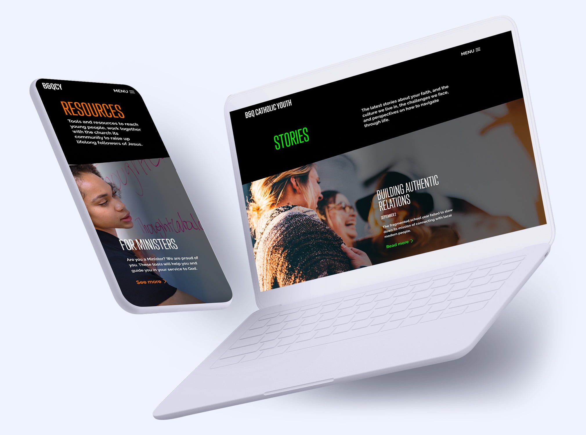
I began the sketching and wireframing process; unfortunately, as the time was constrained, we jumped from sketching to semi-high-fidelity mockups and designed different concepts for the client to consider and approve. The selected style had to be modern enough to be appealing to the youth but clean, simple, and easy to use to allow parents to interact with it.


While the client was evaluating and selecting the design style, the Project Manager was recruiting testers to have an initial Usability Test. I created a series of Prototypes to get a better insight into how intuitive the site is by having users complete pre-defined actions to see where hang-ups are and get general feedback. The actions to achieve where:
- Find a specific event through the calendar.
- Find a Parent Resource and a Story post.
- Find a particular Parish Youth Ministry through Search by Parish.
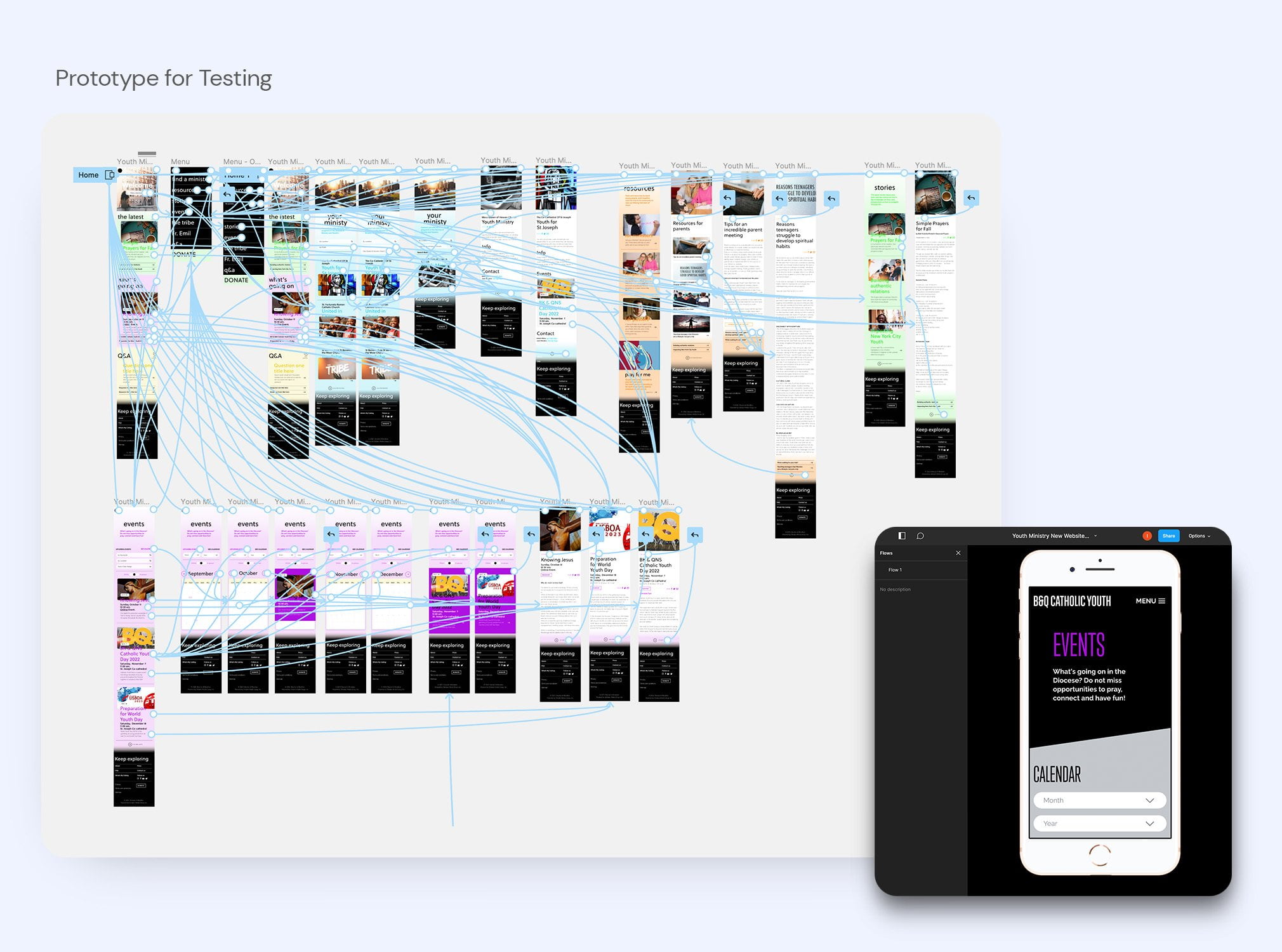
Testing Results
Surprisingly, in the overall usability when completing the tasks, 36% of the testers completed the assignments navigating the path we designed, whereas 51% reached the goals through different pathways. 13% had no success at all. The top menu burger was a key component of the indirect success. Other tweaks I needed to make were:
- Adding a categorized results page, users who went directly to use the search functionality.
- The “Calendar” should be an item on the menu. Users had difficulties accessing the entire calendar.
- The site was not intuitive to navigate for parents looking for information; I need to make that clearer.
- Youth resources and ministry pages were the more successful task to achieve.
- The younger audience showed interest in submitting articles; many of them mentioned the specific topic of mental health. We saw it important to add a resource page, “For Teens.”
On the virtual interview feedback, 16 people found version 3 easy to navigate and visually appealing versus three people’s preferences for version 1. One person had no preference
The prototype limitations also played a significant role in the results. I needed to create a more robust prototype based on the initial findings.


Gathering all this information helped me design a second mobile prototype draft adding additional pages, and improving the menu options, improving the clarity of the visual interface.
The Product Manager ran a second and smaller usability test with different users and some clients to gather more feedback, dropping the unsuccessful rates and bumping the success rate on the desirable paths.
Next Steps
Time and budget were significant constraints that limited the ability to further testing; for this reason, we had to enter into full-completion mode.
The Project Manager mapped the website content document to plug into the final designs, including the mandatory SEO sections for each page (slugs, meta titles, meta descriptions). We discussed with the development team a functionality document, helping us identify similar pages to optimize building time; we did the same with the website components leading me to finalize a basic Design Style guide and a small design system.
It took me one week to complete the design of the whole bulk of pages for mobile and desktop, having several internal and client revisions. There was no official “handing over” to the development team, as we were working simultaneously to meet the deadline.


Outcomes
The page launched one week after the deadline; it took more resources than estimated. The client and our team were happy with the final product. However, the next problem was to encourage the client to recruit content creators and several web administrators to ensure the filling up of the page and the proper functioning. We strongly suggested keeping testing the usability once they entirely populated the page.
We learned that it was a good decision to create a website instead of an app. We should have done more research. At this point, I have no metrics to measure success; nonetheless an excellent learning experience.

Let’s connect!
I’d love to hear from you.
Let’s connect!
I’d love to hear from you.